Design + Production
Website, mobile site, brochures packaging, and stationery.
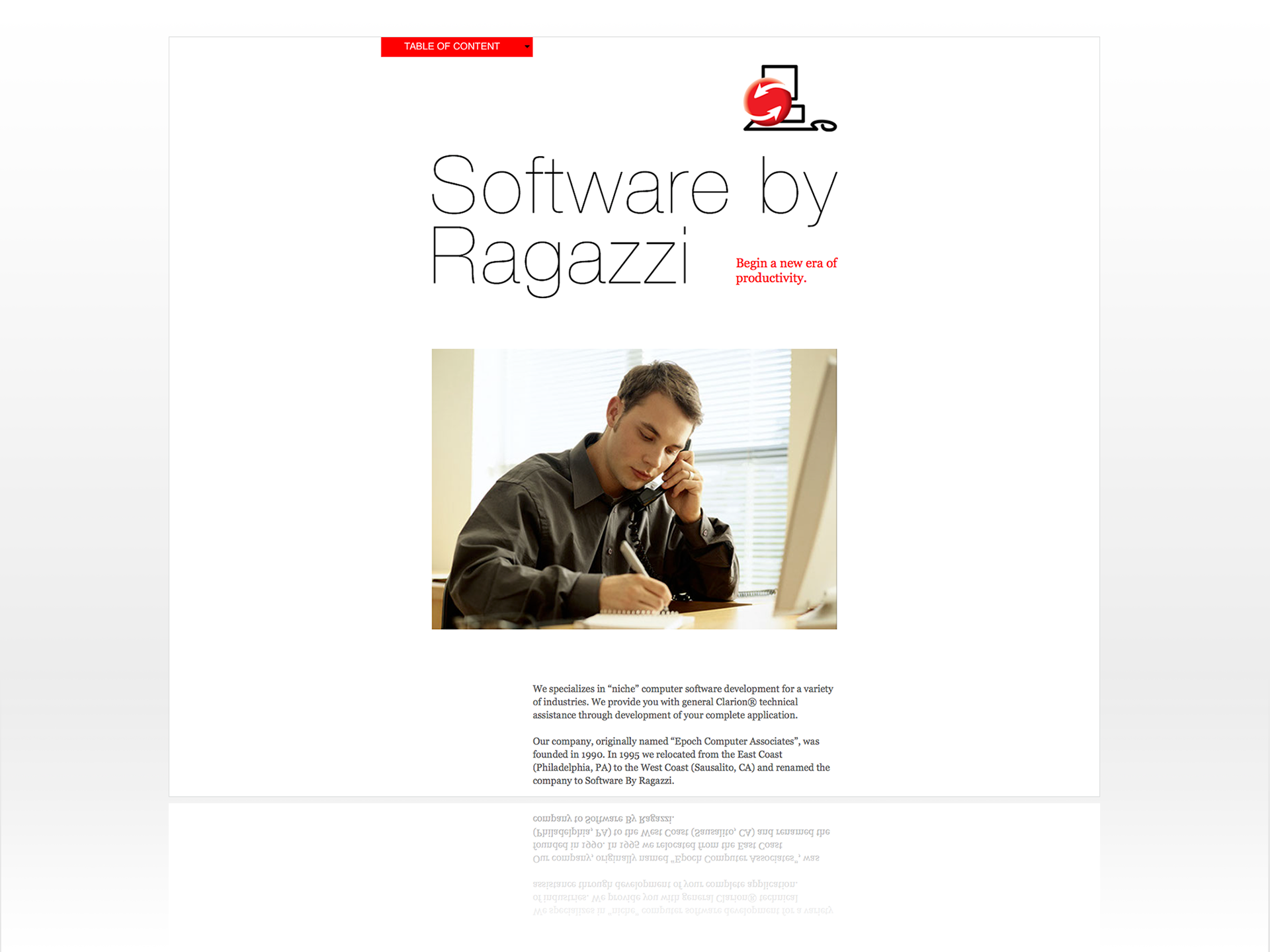
Software by Ragazzi is a software development company with a niche market in various industries that needed a corporate image, documentation for their templates, manuals, and a presence on the internet. They wanted an image representing their line of work and a one-stop solution, clear, clean, and easy to understand in simple language for nonsavvy people.
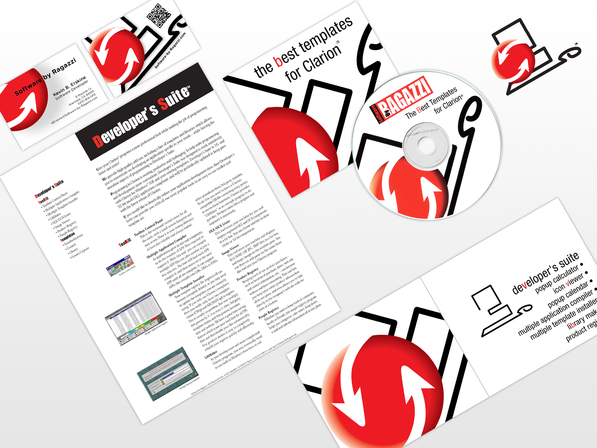
I started with their logo. A simple black outline representing a computer, keyboard, and mouse. On top, a three-dimensional red circle with two white arrows symbolizes the software solution and connection in one place.
Using black, red, and white as negative space, I designed all their stationery to be clear and clean, making it easy to identify in a crowd. The same philosophy was used to create all the brochures, CDs, and CD envelopes to promote their templates.
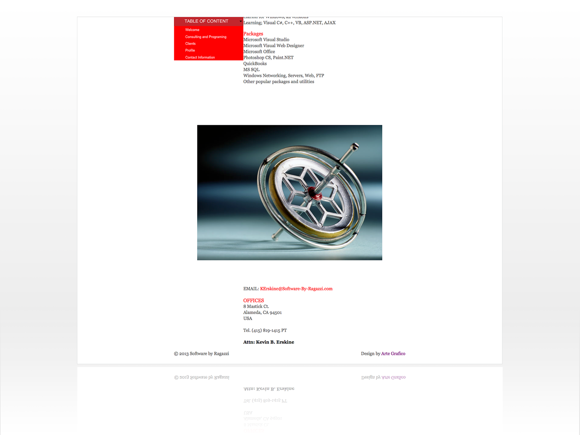
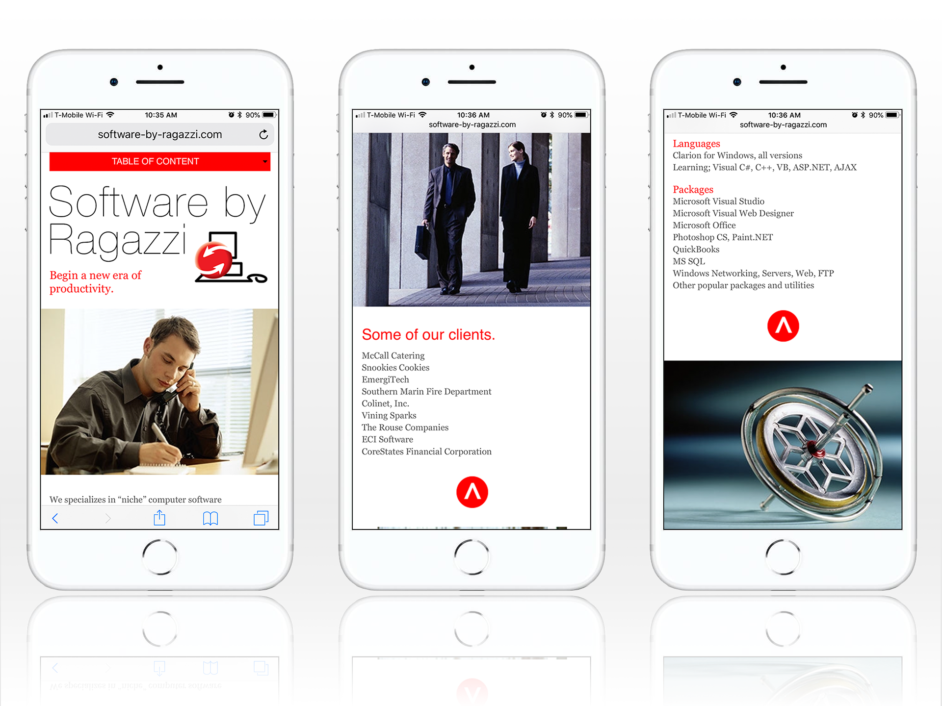
For the website, I tried to convey how easy and simple is the use of their products and to get in touch with the company. The website is one long page, clean and with a simple way to navigate, scrolling up and down or using a menu that appears at the top of the page.
For more than 15 years, I’ve had the opportunity to help Ragazzi Enterprise with all its graphic design needs. We keep working together, evolving and improving our relationship to help Ragazzi Enterprise reach its goals.


